Welcome to Blogmas 2020 🎊
In the spirit of Vlogmas, I’m participating in Blogmas — this megapost where I blog daily about something I coded / designed / learned that day.
I’ll be tackling side project improvements (including this blog!), exploring new technologies, and building potentially useless things. My GitHub contributions graph and free-tier Netlify build minutes are not ready (I enabled Gatsby incremental builds for this).
Check out the semi-interactive calendar visualizer here
Emoji legend
- ⚙️ — fix / hack
- 🎨 — creation
- 📚 — learning a new concept
- 🤔 — investigation / opinion
Table of contents
- ⚙️ 12/1: Bash alias for ISO 8601 formatted time
- 🎨 12/2: Animate SVG hamburger menu to X
- ⚙️ 12/3: VSCode snippets
- 📚 12/4: Leetcoding in Julia
- ⚙️ 12/5: Auto generate Prettier config
- 📚 12/6: Slack logo with CSS Grid
- 🎨 12/7: Skeleton screens + New preview pic
- 📚 12/8: Intro to neural networks
- 🤔 12/9: Spotify Wrapped design analysis
- 🎨 12/10: GitHub Wrapped
- 🎨 12/11: Back to top button (1)
- ⚙️ 12/12: Back to top button (2)
- ⚙️ 12/13: Gatsby plugin to calculate reading time
- 🤔 12/14: GitHub dark mode is too dark
- 📚 12/15: styled-components
- ⚙️ 12/16: VSCode spell check
- 🤔 12/17: Round profile pics
- 📚 12/18: React Native
- 🎨 12/19: karenying.com redesign (1)
- 🎨 12/20: karenying.com redesign (2)
- ⚙️ 12/21: Progressive image loader
- 🎨 12/22: Quarantine running recap
- 📚 12/23: React Redux
- ⚙️ 12/24: Keyboard shortcuts
- 🎊 12/25: Finale
⚙️ 12/1: Bash alias for ISO 8601 formatted time
The frontmatter of every blog post requires a timestamp to display on the post and feed. The Lumen starter that I used had the timestamp formatted in ISO 8601:
date: '2017-08-18T22:12:03.284Z'The Z at the end means that the timezone is UTC — Coordinated Universal Time.
Initially, I was lazy and kept the time as is, only changing the date. Then I decided I wanted the date AND time to accurately reflect when I posted. I would Google “UTC time now” and fill in the details manually — for some reason I thought this was more efficient than one time figuring out how to account for timezone in ISO 8601.
Thus, I’m finally creating a bash alias called iso_date that returns an ISO 8601 date for my frontmatter.
Side note: I recently transitioned from using Moment to Luxon and am using fromISO to parse the frontmatter date.
Bash has a built in date command with field descriptors. With this, we can create our bash alias. We need %Y, %m, %d, %H, %M, %S, and %z.
We want our string to look like %Y-%m-%dT%H:%M:%S%z. This returns the time in your current timezone which is more readable IMO. It should work as expected:
$ date +%Y-%m-%dT%H:%M:%S%z
2020-12-01T08:11:10-0500
Save the command
Open .bash_profile:
vim ~/.bash_profileadd the alias:
.bash_profile
alias iso_date="date +%Y-%m-%dT%H:%M:%S%z"Restart the terminal and yay no more Googling UTC time.
🎨 12/2: Animate SVG hamburger menu to X
I’ve always wanted to make a cool SVG animation. The classic example is smoothly animating a hamburger menu to a close icon:
I referenced these two CodePens as inspiration/help:
Implementation
The skeleton HTML SVG code:
index.html
<svg width="100" height="100" viewBox="0 0 100 100">
  <path class="line top" d="M 20,30 H 80" />
  <path class="line middle" d="M 20,50 H 80" />
  <path class="line bottom" d="M 20,70 H 80" />
</svg>
<path> elements draw the lines based on M (move to x, y) and H (horizontal line to x). So this snippet draws three horizontal lines.
And we’ll define some CSS for these lines:
index.css
.line {
  stroke-width: 6;
  stroke-linecap: round;
  stroke: #8deaff;
  transition: all 500ms;
}stroke-widthdetermines how thicc the lines are-
stroke-linecapchanges the ends of the lines to round- Side note:
stroke-linecap: buttis the default value 🍑
- Side note:
strokesets the colortransitionis normal CSS — we want all the transitions to occur over half a second
Now, we use more CSS to animate the lines on hover via class selectors. Specifically, we want the top and bottom lines to rotate 45 degrees about their left ends and we want the middle line to disappear.
For the top and bottom lines we need to set their transform-origin initially:
index.css
.top {
  transform-origin: 26px 40px;
}

.bottom {
  transform-origin: 26px 60px;
}
I had to play around with transform-origin to get them to rotate as expected.
And for the middle bar:
index.css
.middle {
  stroke-dasharray: 60 60;
}
We initialize the line to have 60 dashes. In order for the initial appearance to look gapless, we display all 60 dashes. When we transform, we’ll only show one dash.
CSS for the hover effects:
index.css
.menu:hover .line {
  stroke: #ff7c7c;
}

.menu:hover .top {
  transform: rotate(45deg);
}

.menu:hover .middle {
  stroke-dasharray: 1 60;
  stroke-dashoffset: -30;
}

.menu:hover .bottom {
  transform: rotate(-45deg);
}
Every line changes color, we rotate top and bottom, and reduce the middle line to one dash while moving it to the middle.
See my CodePen and GitHub repo.
⚙️ 12/3: VSCode snippets
I looked into VSCode snippets today and made my own to help speed up React development in particular.
Empty function component
Snippet:
{
  "react functional component": {
    "scope": "javascript",
    "prefix": "comp",
    "body": ["const $1 = ({ $2 }) => {", "", "\treturn (", "", "\t)", "}"]
  }
}Output:
const /* 1st cursor */ = ({ /* 2nd cursor */ }) => {

  return (

  )
}
useEffect hook
Snippet:
{
  "useEffect hook": {
    "scope": "javascript, typescript, javascriptreact, typescriptreact",
    "prefix": "useE",
    "body": ["useEffect(() => {", "\t$1", "})"]
  }
}Output:
useEffect(() => {
  /* CURSOR */
})
useState hook
Snippet:
{
  "useState hook": {
    "scope": "javascript, typescript, javascriptreact, typescriptreact",
    "prefix": "useS",
    "body": ["const [$1, $2] = useState($3);$0"]
  }
}Output:
const [/* 1st */, /* 2nd */] = useState(/* 3rd */);ClassName
Snippet:
{
  "className": {
    "scope": "javascript, typescript, javascriptreact, typescriptreact",
    "prefix": "cla",
    "body": ["className=\"$1\""]
  }
}Output:
className="[CURSOR]"📚 12/4: Leetcoding in Julia
Confession time: I got to name my sister and I named her Julia. I think I told my parents I picked it because I thought it was a pretty name. But actually, I named her after this girl I hated in preschool. See, I was upset that my sister’s birth meant that we couldn’t go to Disney World because she was too young. So I did the pettiest thing a 4 y/o could think of 😈
Anyway, I thought I’d try out the language that has been coined “the next Python”, Julia. What better way to learn a new language than to solve the classic LeetCode problem, Two Sum, with it?
I’m too lazy to configure the environment so I’m using an online IDE instead.
Here’s my solution:
main.jl
function twosum(nums, target)
  d = Dict()

  for i in eachindex(nums)
    if haskey(d, (target - nums[i]))
      return [d[target - nums[i]], i]
    else
      d[nums[i]] = i
    end
  end
end

@show twosum([2,7,11,15], 9)
Running it, we get:
$julia main.jl
twosum([2, 7, 11, 15], 9) = [1, 2]
Initial comments
- The syntax strikes me as a mix between Python and Ruby
- Arrays and dictionaries operate as expected — except it’s 1-BASED INDEXING
@showmacro is cool
Overall thoughts
Julia was designed for performance in mind which is always s e x y. While my solution is untyped, Julia is dynamically typed. We also love being ~flexy~. BUT the one thing I can’t get on board with is 1-based indexing 🤮 All in all impressed, I like it, and excited to see more mainstream usage!
Rate: 6.5/10
⚙️ 12/5: Auto generate Prettier config
Prettier is one of my favorite VSCode extensions. I like creating a Prettier config for every project based on the same template and tweak it slightly depending on the proj. I found myself copy and pasting the same .prettierrc file every time which is pure nonsense.
Thus I wrote a bash script to generate the template:
prettier.sh
#!/bin/bash

cat > .prettierrc << "EOF"
{
  "tabWidth": 2,
  "singleQuote": true,
  "jsxSingleQuote": true,
  "semi": true,
  "trailingComma": "es5",
  "bracketSpacing": true,
  "jsxBracketSameLine": false,
  "arrowParens": "always",
  "printWidth": 80
}
EOF
And added a bash alias:
.bash_profile
alias pret="sh ~/Documents/Projects/prettier.sh"Now all I have to do is type pret in my terminal!
📚 12/6: Slack logo with CSS Grid
As someone who’s been team Flexbox, I wanted to see what’s up with all the hype around Grid.
The Slack logo fits exactly in a 4 x 4 grid so we’re gonna recreate it with divs (please never make your logo and put it on your site as divs omg).

For our grid container, we’ll declare each cell to be 50px big and the gap between to be 12px:
index.css
.grid {
  display: grid;
  grid-template-columns: 50px 50px 50px 50px;
  grid-template-rows: 50px 50px 50px 50px;
  grid-gap: 12px;
}
Now we can fill in with our divs:
index.html
<div class="grid">
  <div class="blue a"></div>
  <div class="blue b"></div>
  <div class="green a"></div>
  <div class="green b"></div>
  <div class="yellow a"></div>
  <div class="yellow b"></div>
  <div class="red a"></div>
  <div class="red b"></div>
</div>
Each div has a color class name as well as a if it’s one-celled, or b if it takes up two cells.
Let’s look at the CSS for the blue section:
index.css
.blue.a {
  grid-column: 2;
  grid-row: 1;
}

.blue.b {
  grid-column: 1 / 3;
  grid-row: 2;
}
.blue.a only takes up one cell, so we only need to declare its row and column which are 1 and 2 respectively (Grid is 1-indexed):
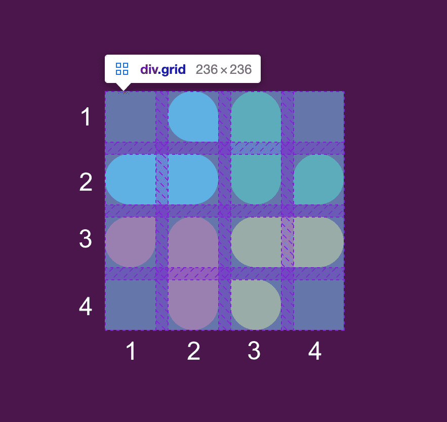
.blue.b is in the 2nd row so we put 2 for that. Then for column, we use start / finish (the div extends up to finish). .blue.b starts at column 1 and ends right before column 3 which gives us 1 / 3.
We can fill out the rest of the colors by examining which cells they lie in. I also added more CSS to configure the colors and rounded borders. You can see the demo on CodePen and the full code on GitHub.
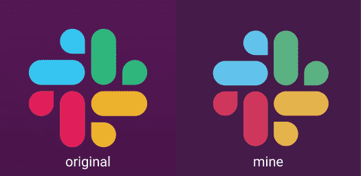
Our finished product is pretty close:
Overall thoughts
Grid is pretty easy to use. It definitely has a ton of other features that I didn’t explore in this simple build. It makes sense to use it for 2D layouts instead of nesting Flexbox (@me oops). I bet I will frequent CSS-Tricks’ Grid guide as I start to use Grid more often (the Flexbox guide has been a lifesaver).
Rate: 8/10
🎨 12/7: Skeleton screens + New preview pic
I think skeleton screens are so cute — I made one for the desktop view of this site’s homepage:
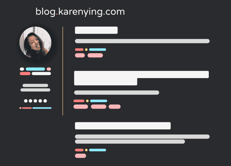
In practice, perhaps only the right side (posts) would be abstracted but I wanted to simplify as much as possible. And since my site is static, this wouldn’t really be applicable anyway 😛
Skeleton screens, especially with left to right motion animations, make the load time seem faster. I read about them more in depth here. Thinking about animating a skeleton screen as a future blogmas post!*
Btw, I changed this site’s preview pic to a variation of the above skeleton screen:

She cute, she cute af. I’m obsessed 🥰 (the old preview was the cover image of my v2.0 Stable Release post).
*Update: Just merged a PR for work that animated a skeleton screen for a loading state! I lifted code from this CodePen.
📚 12/8: Intro to neural networks
Hi, my name is Karen and I’m allergic to React class components, supporting IE 11, infra dev, and … oh yeah, mAcHiNe LeArNiNg.
I’m challenging the last one by doing Victor Zhou’s top post/tutorial — Machine Learning for Beginners: An Introduction to Neural Networks. I dropped Princeton’s ELE 435: Machine Learning and Pattern Recognition, after the midterm so this should be interesting.
Let’s do it!
-
Building Blocks: Neurons
- Ya makes sense
- Side note: I thought NumPy was pronounced “num-pee” until someone told me it’s Numerical Python not Numerical Pee-thon
-
Combining Neurons into a Neural Network
- Mmm we good
-
Training a Neural Network, Part 1
- Still following but MSE is giving me PTSD to my ORFE days
-
Training a Neural Network, Part 2
- Alright I was doing okay until we got to the multi part, and then my eyes glazed over 🙄
- Well I trust the math/code and SGD makes sense on a high level
Overall thoughts
The tutorial opens with:
This post is intended for complete beginners and assumes ZERO prior knowledge of machine learning.
And I mean ya dat me and it was easy enough to follow — I enjoyed how well-structured it was with the diagrams, tables, code blocks etc.
However, I still feel the same way towards ML — not really interested in the theory/math behind it because it’s a bunch of icky calc and lin alg. Maybe I’d be more interested in the applications (import sklearn amiright). But then again, applying ML = training model, waiting for results, tweaking params, repeat … soooooo I think I’ll stick to web dev.
Rate: 8 (post itself), 3 (content) → 5.5/10
🤔 12/9: Spotify Wrapped design analysis
Written while listening to my Top Songs 2020 playlist
I read this article around this time last year about Spotify Wrapped 2019’s UI/UX design. Here’s my take on this year’s.
Spotify Wrapped is the most simple form of data viz. It shows that the app can do +=1, yay! Yet people still eat it up because of its nice UI along with how personal and immersive the experience feels.
We’ll start off with the 4 basic colors Spotify used:
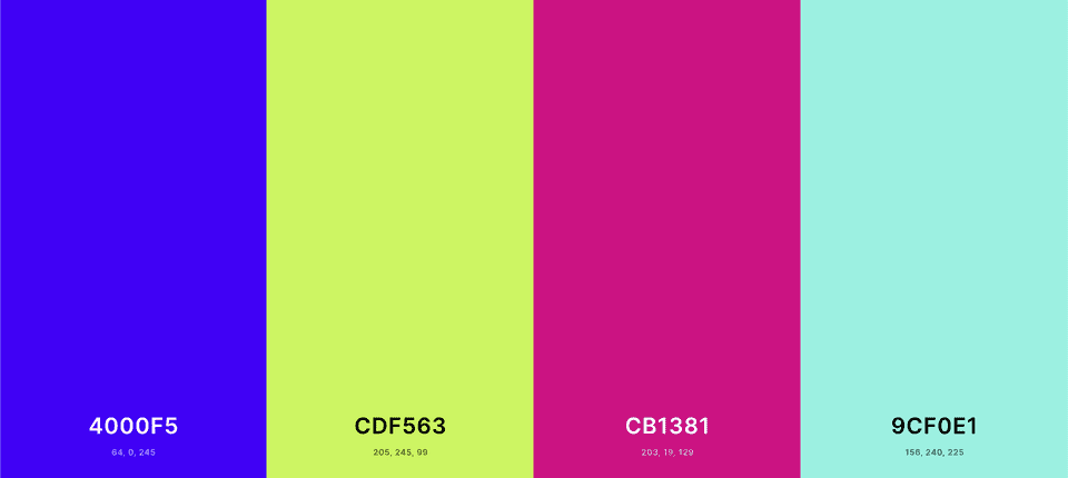
I’ve written about this before — Spotify’s dark-mode only UI allows for colorful album art to pop, just like how theaters dim their lights for shows. Thus, these 4 bright colors especially stand out amongst the darker backgrounds. You can see the same effect on this site.
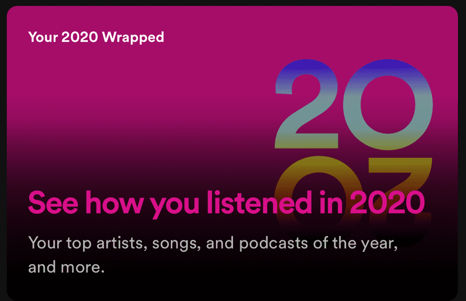
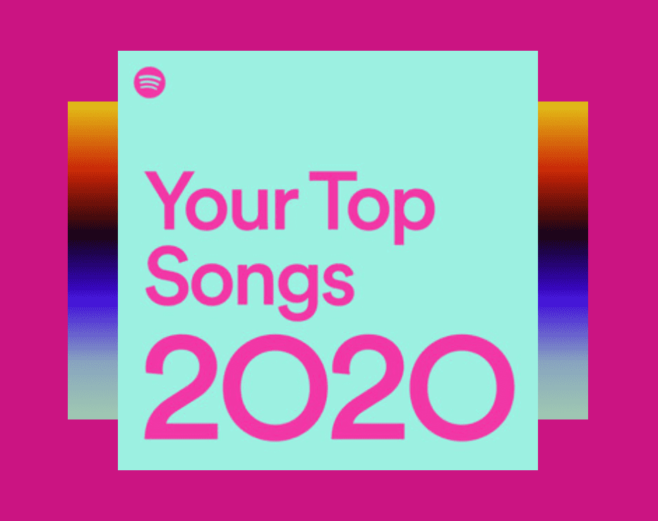
With these 4 colors, Spotify only uses 2 pairings throughout the story — dark blue with green, and pink with cyan. These pairings have relatively high contrast ratios which increases text legibility (light green with cyan would be too hard to read). Here’s an example of the dark pink on cyan:
In addition to this fixed color palette, Spotify also uses a rainbow-ish gradient as a common theme. This vertical gradient features the dark blue, cyan, and green from the palette, as well as black and warmer sunset-like hues. It appears primarily as a background, with the other 4 colors in the foreground. The gradient is also animated in the story. Its vertical movement gives more depth and a sense of momentum, allowing the data to seem more interesting.
You would think that this combo of colors from all across the spectrum would clash. However IMO, the gradient really ties the contrasting colors together. You end up with a sort of tropical / beachy / summery vibe.
These bright colors, along with uplifting comments such as:
Even in 2020, you still found ways to grow
You’re a pioneer
make you reflect on your year of music with a positive attitude. And that’s their goal — they want you to like this recap so much that you share it with friends and on social media (if you didn’t IG story it, did you even listen to music?). Spotify’s stock soared because of this Wrapped hype. Clearly they have found a winning marketing/branding strat.
Well here’s my 2020 Spotify Wrapped:
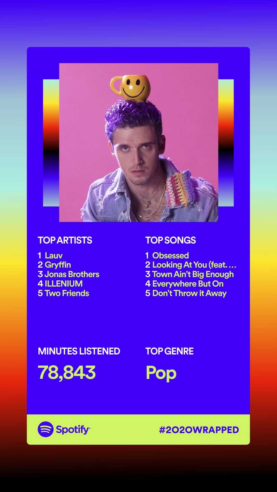
Just a girl who likes to beep boop while listening to beep boop music!
🎨 12/10: GitHub Wrapped
Amidst all this end of the year recap hype, I designed a GitHub Wrapped:
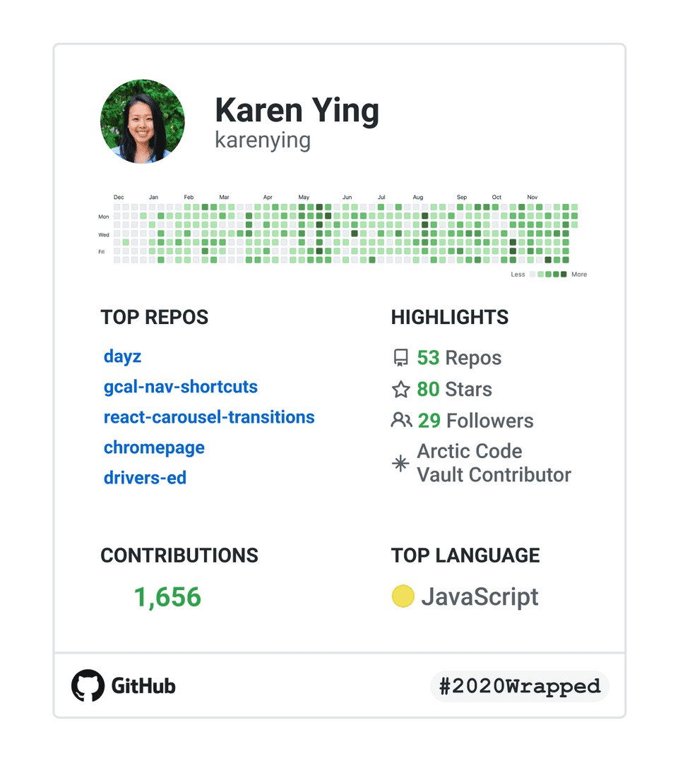
2020 was definitely a huge coding year for me! I switched my major to CS at the end of 2019, so this year has been me diving into the world of web dev. I worked on some full stack stuff and realized I definitely have a pref for frontend and an interest in product / design.
GitHub was at the center of all this — it’s my most visited page on Chrome. At this point, I’d think it’s hot if someone named a branch after me 🥺
🎨 12/11: Back to top button (1)
Implemented an hour before my first final exam
This Blogmas post is getting obscenely long so I created a back to top button that hangs around the bottom right corner of posts.
I decided on an upwards chevron from Ionicons but I’m using it through React Icons. Side note: At some point I wanna stop using React Icons and import the SVGs but I’m lazy.
This is the design I settled on for mobile:
The mobile button is different from the desktop version. I toyed with only having the icon have the shadow, but I felt like it didn’t stand out enough on mobile because it was on top of white text. The desktop version is just the chevron to the right of the text, completely flat. The desktop icon has a shadow on hover (not the entire button). This is consistent with the home button in the top left corner.
Implementation
All the CSS isn’t very interesting — except that of course it’s position: fixed and I had to use calc for the desktop version to ensure that it was the right distance from the middle content.
Adding the back to top click handler wasn’t hard either:
const scrollToTop = () => {
  window.scrollTo({ top: 0, behavior: 'smooth' });
};

<div onClick={scrollToTop} />;
scroll-behavior: smooth has better browser compatibility than window.scrollTo but I couldn’t get it to work 😞
A trickier thing was getting the button to hide when the user is scrolling. This is for mobile only. I tested it on desktop but it seemed unnecessary since the button wasn’t over text. This is what I ended up doing:
const [opacity, setOpacity] = useState(1);

useEffect(() => {
  let timeoutID;
  const onScroll = () => {
    setOpacity(0);
    clearTimeout(timeoutID);

    timeoutID = setTimeout(() => {
      setOpacity(1);
    }, 100);
  };

  window.addEventListener('scroll', onScroll);

  return () => {
    window.removeEventListener('scroll', onScroll);
    clearTimeout(timeoutID);
  };
}, []);

<div onClick={scrollToTop} style={{ opacity }} />;
with a transition: opacity 100ms property for the div.
Let’s break this down:
- First, we define the opacity of the button as a state variable and set it with in-line styling
- On mount, we add an event listener for scrolling —
onScrollis called every time the user scrolls - Immediately after detecting scrolling, we set the opacity of the div to
0(I chose opacity instead ofdisplay: nonebecause we can’t usetransitionondisplay) - We clear the previous timer and set a new one for 100ms
- After 100ms, if a new scroll hasn’t been detected, then the div’s opacity is restored to
1 - On unmount, we remove the scroll listener and clean up the timeout
Another way I could have done this is using refs:
const scrollRef = useRef();

useEffect(() => {
  let timeoutID;
  const onScroll = () => {
    scrollRef.current.style.opacity = 0;
    clearTimeout(timeoutID);

    timeoutID = setTimeout(() => {
      scrollRef.current.style.opacity = 1;
    }, 100);
  };
}, []);

<div onClick={scrollToTop} ref={scrollRef} />;
While the using a state variable triggers a rerender every time and using refs does not, the first implementation is considered the “correct” React way. It’s declarative — in the first case, it declares what the opacity should be and the state variable reacts to change the CSS. The second method directly (imperatively) sets the opacity with ref.current.
Either way, I’m happy with how it turned out!*
*Update: Was not happy with how it turned out and hence this next post 😡
⚙️ 12/12: Back to top button (2)
Implemented an hour before my second final exam
Hiding the back to top button on every scroll was a lil distracting even on mobile. Instead, I want it to be hidden if the user is scrolling down, but visible if the user scrolls up. I’m also making the home button appear at the top simultaneously.
Here’s what they look like (you should be able to see on mobile!):


I added a border to both because they weren’t very visible without.
Implementation
Like the resourceful dev that I am, I basically stole the code from this Stack Overflow answer 😀
I replaced the previous scroll handler with this:
const [isScrollingUp, setScrollDir] = useState(false);

useEffect(() => {
  const minShowThreshold = 812;
  let lastScrollY = window.pageYOffset;
  let isScrolling = true;
  let requestID;

  const updateScrollDir = () => {
    const scrollY = window.pageYOffset;

    setScrollDir(scrollY > minShowThreshold && scrollY < lastScrollY);
    lastScrollY = scrollY;
    isScrolling = true;
  };

  const onScroll = () => {
    if (isScrolling) {
      requestID = window.requestAnimationFrame(updateScrollDir);
      isScrolling = false;
    }
  };

  window.addEventListener('scroll', onScroll);

  return () => {
    cancelAnimationFrame(requestID);
    window.removeEventListener('scroll', onScroll);
  };
}, []);
And a separate useEffect handles the opacity:
useEffect(() => {
  setOpacity(isScrollingUp ? 1 : 0);
}, [isScrollingUp]);
Side note: I remember being shook that you could have multiple useEffects in the same component, each with different dependencies 🤯
Let’s break this down:
- While scrolling, we keep the old position, and check if the new position is higher than the old. If it is, then we set
isScrollingUpas true - I set a
minShowThresholdof812pxso that when the user is close to the top of the page, the buttons wouldn’t show even if they are scrolling up isScrollingmakes sure thatupdateScrollDiris only called once per repaint. The code works without therequestAnimationFramebusiness. It’s basically acting as throttling so I guess I’ll keep it- In a separate
useEffect, we set the opacity of the buttons based onisScrollingUp
This is hopefully the last part of the back to top saga.
⚙️ 12/13: Gatsby plugin to calculate reading time
Implemented before my third and fourth (last!) finals and written after
Yay we’re officially more than halfway through Blogmas and done with fall semester 🎉
Before, I calculated time read by legit copy and pasting a post into a Medium draft and stealing their calculation (or just taking it if the post was already on Medium). I had a minutes field in the frontmatter of every post and would query it.
Instead of this jank approach, I’m using the gatsby-remark-reading-time plugin. I followed the installation instructions and it worked without any hiccups.* Now I don’t have to manually update the frontmatter after every Blogmas minipost.
This plugin uses the reading-time package. I peeped at how it calculates number of minutes. It seems like it doesn’t count images like Medium does.
Here are the posts where there’s a difference in calculated reading time between Medium and this plugin:
We can see that images increase Medium’s calculated time, whereas codeblocks increase the plugin’s (on Medium I embedded GitHub gists).
Which one is more accurate? 🤷🏻♀️
*Update: UmmMMMmMmMm this plugin has a race condition I swear so I’m reverting back to my old ways of relying on Medium. I would click a post or next page and sometimes nothing would render until I refreshed. The console would say that the readingTime was undefined in the GraphQL query which would cause the page to crash. Maybe I set it up wrong? Idk I’ll have to investigate more
🤔 12/14: GitHub dark mode is too dark
Today’s minipost ended up being its own post.* Back to our regularly scheduled programming (wow accidental pun) tomorrow!
*Update: I’m currently 2 days ahead of Blogmas which explains this timestamp — On 12/12, GitHub Dark Mode is Too Dark peaked at #2 on the front page of Hacker News 😮
📚 12/15: styled-components
I’ve always wanted to try styled-components. Today I followed the Getting Started tutorial on their homepage.
They show us how to create a button and a primary variation of it:
Button.js
import styled, { css } from 'styled-components';

const Button = styled.button`
  background: transparent;
  border-radius: 3px;
  border: 2px solid palevioletred;
  color: palevioletred;
  margin: 0.5em 1em;
  padding: 0.25em 1em;

  ${(props) =>
    props.primary &&
    css`
      background: palevioletred;
      color: white;
    `}
`;
Side note: I had to brush up on tagged templates.
And we use it as we’d expect with an optional primary prop:
App.js
<Button>Normal Button</Button>
<Button primary>Primary Button</Button>
I created the same button with my own component + Sass to compare:
Button.js
const Button = (props) => {
  const { primary, children } = props;

  const className = primary ? 'Button primary' : 'Button';

  return <button className={className}>{children}</button>;
};
Button.scss
.Button {
  background: transparent;
  border-radius: 3px;
  border: 2px solid palevioletred;
  color: palevioletred;
  margin: 0.5em 1em;
  padding: 0.25em 1em;

  .primary {
    background: palevioletred;
    color: white;
  }
}
With styled-components, we skip the step of creating the React component — plug in some CSS and it works out of the box. Pretty cool.
Overall thoughts
I dabbled with having CSS in React files with Material-UI. And I have the same mixed feels with that as I do with styled-components.
Perhaps it’s the way I learned web dev but I really like separating styling and “business logic”. However, I can see why for something reusable / versatile like a button, styled-components makes sense — especially since it takes out the middleman of creating a React component.
I also noticed was that when I inspect element on a styled-components element, the class names aren’t semantic. For example I saw class="sc-bdfBwQ bGgqpE". Often times I use the class name to locate an element in the code base. Not sure what I would do in this case.
Anyways, while styled-components is something I’m definitely not used to, it has made me want to keep an open mind. It really does feel like a more modern approach to styling.
Rate: 8.5/10
⚙️ 12/16: VSCode spell check
Good read! Small typo here. pic.twitter.com/BZp5wsEvAz
— ✪ Roberto Inetti ✪ (@Taytus) December 13, 2020
Finally got around to installing a spell check extension in VSCode. Before I would catch typos by copying and pasting into a Google Doc. Yep, not proud of that one.
I installed Spell Right and changed the typo notification color from “error” to “information”. The red from error was way too jarring and made me think my markdown doesn’t compile (which isn’t really a thing?). Now typos show up as a nice unoffensive light blue so I’m a fan! I also configured the extension to run only on markdown files.
Here’s what was added to my global settings.json:
settings.json
"spellright.notificationClass": "information",
"spellright.documentTypes": ["markdown"]
Goodbye typos 👋🏼
🤔 12/17: Round profile pics
Most social media apps utilize round profile pictures instead of square ones nowadays. If you think back to just a couple of years ago, square pics were definitely more widely used. When did this change happen and why?
Facebook, Instagram, and Twitter switched to round propics around 2016 / 2017 and many apps followed suit. The reasoning is quite simple — a circular image draws the eye more the center of a face than a square one. Round pics cut off the unnecessary busy borders which helps highlight faces.
We see very few sharp corners in real life, so it makes sense that roundness is popular in UI/UX design (try to spot a corner on this site). Sharp edges on websites make me a bit uncomfy. Round corners are so much friendlier!
📚 12/18: React Native
As a frontend web dev, I’ve realized that responsiveness is the bane of my existence. But what about developing for mobile only? To answer that, I tried React Native.
I followed the official env setup docs and used Expo CLI to run my test app. It was all pretty smooth. I really liked the idea of scanning a QR code to run stuff on my phone directly. That’s always more realistic than using an emulator.
First, I familiarized myself with the syntax. Here are some technical details I noticed right away compared with React:
Views are the same asdivs — HTML elements aren’t a thing in React Native. Instead, out of the box components are used (imported from'react-native')- CSS got replaced with
StyleSheets. It reminds me of the Material UImakeStyleshook. Many styling properties are the same (there’s still flex!). But like withstyled-components, it seems like you can’t really separate the styling from the JS onClickhandler is calledonPress— pretty appropriate- There’s no “Inspect Element” that I know of which can make debugging difficult?
Then I played around with React Native’s Core Components and APIs. I was impressed with the amount of native (ha) components that exist and how robust they are. For example, the Modal component — Something like this only exists with external libraries like Material UI for React; Yet, it just comes with React Native (with animations too).
Overall thoughts
I really really liked React Native. Idk why that would be a surprise since I’m a React girl at heart (I often joke about getting a React logo tat). Even though I hate keeping responsiveness in mind for web apps, I would probably like it a lot more if I was developing for mobile only.
There’s so much less screen real estate. This means that minimalism and functionality are critical — both things I’m into. Mobile also comes with more interactive features like long presses, swipes, vibrations etc. which are fun to consider.
All in all, I’m impressed with the dev experience and the existing Core Components. I think if I were to do more mobile only dev, I would enjoy its quirks. It’s the same same but different as React!
Rate: 9.2/10
🎨 12/19: karenying.com redesign (1)
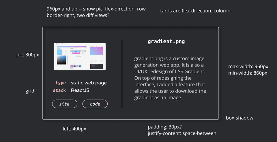
I’ve been dying to get rid of the carousel on the projects page (even though I wrote a tutorial on it rip). It looks bad on mobile because the arrows take up precious width space. It’s also hard to click on things that are close to the edge of the screen. Instead, each project card will appear vertically stacked so that the user can scroll through them. On tablet, it’ll be the mobile cards in a grid.
Introducing my proposed projects page designs with some CSS notes (peep the Figma file):
Desktop
Mobile
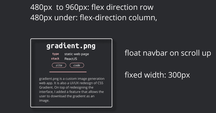
I still struggled with incorporating the image in the mobile card. The shapes don’t really work out? I toyed with the idea of having some kind of click / hover action but that seems unnecessary finicky.
This design change will bring the styling of karenying.com closer to that of this blog’s. Hello Ubuntu Mono and Open Sans. Each card will still have one of the four accent colors but it’ll be more subtle. I was also definitely influenced by the Blogmas calendar visualizer.
Tomorrow’s post will be about implementing this change! I’m hoping to move away from using Material UI for this and I’ll be updating the page with some more recent projects.
🎨 12/20: karenying.com redesign (2)
Today I just implemented the redesign from the previous post. I’m happy with how it turned out.
In addition to being more stylistically similar to this blog site, the mobile experience is so much better:
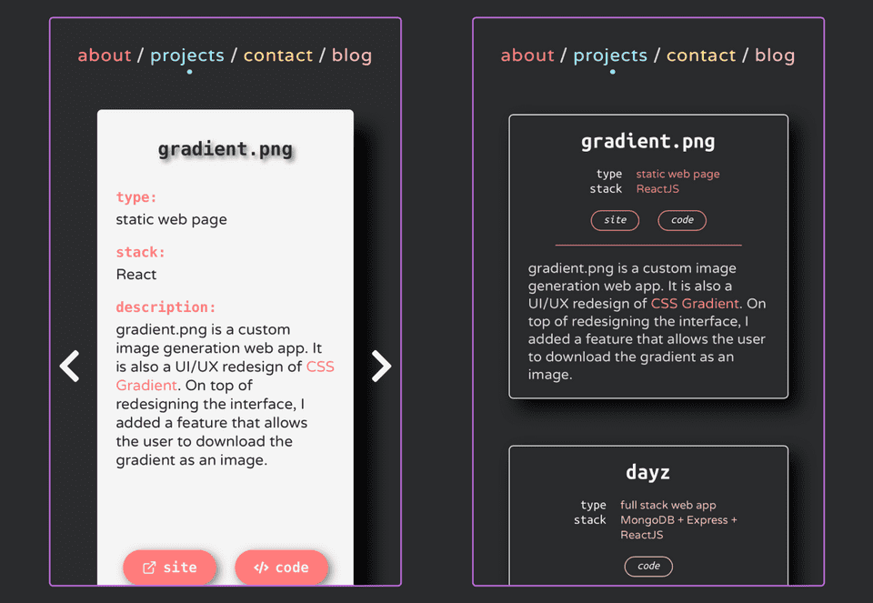
The purple outlines an iPhone 12 Mini’s Chrome wrapper border. The carousel arrows are gone and I condensed the info into a shorter card. I also added a couple more projects. I put Blogmas on there so I had to create a cute graphic for it (now the new preview / cover pic of this post — one at the very top). I like it so much 🥰
For tablet view, I ended up not doing a grid of cards — the mobile cards are actually different heights, so it’d look a bit strange / I couldn’t be bothered to style them for the grid. GAnalytics says that like 2% of my visitors are on tablet so…
It was definitely a challenge to sift through the code I wrote 7 months ago. It was also interesting to see how my design preferences have changed. Now, I feel like the old site’s style as a tad too youthful / colorful haha. I set up a preview of the old site that you can peep to compare.
Finally, I made a new preview graphic for karenying.com:

⚙️ 12/21: Progressive image loader
I use the React Progressive Image npm package on my portfolio site to progressively load all the images.
Here’s an example of it in action on my home page:
import ProgressiveImage from 'react-progressive-image';

import Karen from '../Assets/karen.png';
import MiniKaren from '../Assets/mini-karen.png';

<ProgressiveImage src={Karen} placeholder={MiniKaren}>
  {(src, loading) => (
    <img style={{ opacity: loading ? 0.8 : 1 }} src={src} alt='karen' />
  )}
</ProgressiveImage>
While it’s easy to use, it has two main problems:
- The placeholder image needs to be scaled either manually or with CSS, to the same dimensions as the source image. If you don’t and use a smaller pic for the placeholder, you’ll see a visually smaller pic while the original image loads. It’s a bit trippy when the bigger image comes in because of the size difference
- The component doesn’t blur the placeholder image. So you have to filter the image beforehand with some 3rd party app
I implemented my own version that solves these issues.
Here’s the component:
ProgressiveImage.js
import { useState } from 'react';

import './ProgressiveImage.css';

const ProgressiveImage = ({ src, placeholder, width, height, alt }) => {
  const [opacity, setOpacity] = useState(1);

  return (
    <div
      className='ProgressiveImage'
      style={{ width: `${width}px`, height: `${height}px` }}
    >
      <img
        className='ProgressiveImage-mini'
        src={placeholder}
        style={{ opacity }}
        width={width}
        height={height}
        alt={alt}
      />
      <img
        className='ProgressiveImage-img'
        src={src}
        onLoad={() => setOpacity(0)}
        width={width}
        height={height}
        alt={alt}
      />
    </div>
  );
};

export default ProgressiveImage;- It takes in
widthandheightprops (in pixels) so that the container and the two images can all be the same size - The second image has an
onLoadhandler that sets the opacity of the placeholder to0when it finishes loading
And here’s the corresponding CSS:
ProgressiveImage.css
.ProgressiveImage {
  position: relative;
}

.ProgressiveImage-mini,
.ProgressiveImage-img {
  position: absolute;
}

.ProgressiveImage-mini {
  transition: opacity 150ms linear;
  -webkit-filter: blur(2px);
  filter: blur(2px);
}- The placeholder image has a
transitionproperty for opacity. This allows the transition to the source image to be gradual - I use a filter to blur the placeholder, hence solving issue #2
- The
positionproperties allow the images to be on top of each other
And here it is in action:
App.js
import Karen from './assets/karen.png'; // 1.1mb
import MiniKaren from './assets/mini-karen.png'; // 15kb

import ProgressiveImage from './components/ProgressiveImage/ProgressiveImage';

<ProgressiveImage
  src={Karen}
  placeholder={MiniKaren}
  width='200'
  height='200'
  alt='karen'
/>
Pretty simple, right? You can peep the GitHub repo.
I don’t think I’ll go back and replace React Progressive Image. I’ve already scaled and blurred my placeholder images haha but this was fun to implement!
🎨 12/22: Quarantine running recap
A different kind of post today but enjoy the data vis!
When Princeton kicked us off campus in March, I lost access to a gym and Frisbee practice 3x a week. I knew that if I were to maintain my sanity through quarantine, I’d have to figure out a workout system.
So I picked up my 4 y/o beat up sneakers and started running. After 9+ months, I’m reflecting on this ~journey~.
Exercise log
I religiously scheduled workouts in GCal so I made a visual to sum up what I did. It should be color blind friendly.
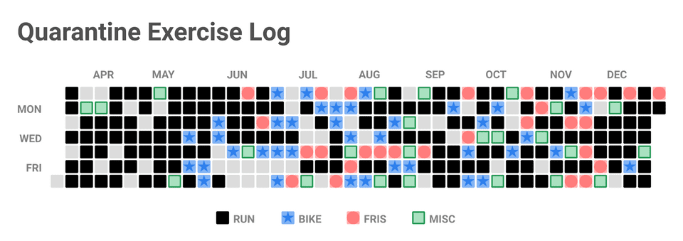
Some trends before I get to running in particular:
- Misc = walk, hike, jump rope circuit etc.
- I was scared to bike during the early days of the pandemic because if I had gotten into an accident and had to go the hospital, that was not worth. Early pandemic days were wild
- Ran noticeably less during the summer because it was too damn hot. Biking / fris were more enjoyable
- Stopped biking recently because cold + wind + snow = not a good time
- Not on this chart, but my friend Judy and I do core most nights
Running
By the numbers:
- 576 miles
- 147 runs
- 2 pairs of sneakers destroyed
- 20% decrease in resting HR
- Hottest run: 93°
- Coldest run: 22°*

When I started out, 2 miles was rough. Now I run 3 - 6. P r o g r e s s !
I don’t time my runs because I don’t want to get fixated on numbers. Without the pressure of feeling like I need to get faster, running is still enjoyable and even relaxing.
You have to run in shitty weather so that you can appreciate running in good weather ☀️
This was something I told myself in order to get my ass outside when it was pouring and cold. It definitely helped build this habit.
The only other time in my life I ran consistently was sophomore year of HS. I never thought I’d get into running again. I saw it as an absolute last resort because I much preferred other forms of exercise. But this pandemic forced me to lace up my sneakers again and I’m glad.
Almost 600 miles later, I can finally say I like running and I am a runner 🏃🏻♀️
📚 12/23: React Redux
Story time: Back in May when I was a React noob (still a noob but less so now), I built gradient.png, a web app that generates gradients. It looks great but under the hood it’s some spaghetti ass code.
Every component depends on the “stack” of colors which was stored as state variables in App.js. I had no concept of state management and prop drilled the F outta those poor components. Peep the GitHub repo if you wanna vom 🤮
Thankfully, in the last 7 months, I’ve added React Context and MobX to my state management tool belt. Today, I took a stab at learning another popular option, React Redux.
I followed the Getting Started page and used the official Redux template for CRA:
$ npx create-react-app my-app --template reduxI ran the app and was greeted with a counter screen — I could increment and decrement the counter with buttons.
I spent some time exploring the starter code to understand how the counter state was managed. Then I added my own twist to apply these concepts.
The twist: Allow the user to change the app’s text color by entering a valid hex color code.
Implementation
First I created a slice, aka a section of the global store that kept this hex string record.
hexSlice.js
import { createSlice } from '@reduxjs/toolkit';

export const hexSlice = createSlice({
  name: 'hex',
  initialState: {
    value: '000000',
  },
  reducers: {
    changeHex: (state, action) => {
      state.value = action.payload;
    },
  },
});

export const { changeHex } = hexSlice.actions;

export const selectHex = (state) => state.hex.value;

export default hexSlice.reducer;- We set the initial color to black
- Create a reducer that takes in a string, and sets the state’s hex value to the string
- Export this reducer,
changeHex, so that we can use it with our input component - Export
selectHexwhich is a selector that keeps track of the current hex
Then we add this new slice’s reducer to our store:
store.js
...
import hexReducer from '../features/hex/hexSlice';

export default configureStore({
  reducer: {
    counter: counterReducer,
    hex: hexReducer,
  },
});
And now we can use the reducer in the input component:
HexInput.js
import { useDispatch } from 'react-redux';

import { changeHex } from './hexSlice';

const ENTER_KEY = 13;

const HexInput = () => {
  const dispatch = useDispatch();

  const handleKeyDown = (e) => {
    if (e.keyCode === ENTER_KEY) {
      const { value } = e.target;

      dispatch(changeHex(value));
    }
  };

  return <input onKeyDown={(e) => handleKeyDown(e)} />;
};

export default HexInput;- We use the
useDispatchhook to connect to the store - If the enter key is pressed,
changeHexis called with the current value of the input
And finally, we can change the color of the app’s text:
App.js
...
import { useSelector } from 'react-redux';
...

import HexInput from './features/hex/HexInput';
import { selectHex } from './features/hex/hexSlice';

function App() {
  const hex = useSelector(selectHex);
  const color = `#${hex}`;

  return (
    <div className='App' style={{ color }}>
      ...
        <HexInput />
      ...
 );
}useSelectorallows us to extract the store’s current hex value- We convert that value to a valid hex string for inline-styling
- Style the
Appcomponent
It worked as expected and with that, I’ve successfully crash coursed through Redux.
Overall thoughts
Context >> Redux >> MobX
Context is probably better for super simple global states — toggling light / dark mode is a classic example. This text color state was simple enough that Redux seemed overkill but I could definitely see it being useful for more complex state management.
I’ve only touched the tip of the Redux iceberg but seems pretty okay to me. It’s so well documented and supported that I’m sure it would be nice to use.
Rate: 7.5/10
⚙️ 12/24: Keyboard shortcuts
It’s the last official day of Blogmas and I can’t put off this post any longer.
Backstory: I ordered this mechanical keyboard on Black Friday, even paying expedited international shipping. I had hoped that it would come in time for December, a month filled with keypresses and beep booping. I had planned this Blogmas post where I learn text editing shortcuts on my brand new keyboard. BUT IT’S STILL NOT HERE!*
So today I am practicing the shortcuts on these sticky MBP butterfly keys instead 😭 I mostly looked at ones from this official VSCode doc. I’m familiar with the basic ones but the goal is to almost never use the touchpad when coding.
Shortcuts
Written entirely with these newly learned shortcuts
| Shortcut | Description |
|---|---|
| ⌘ ↑ / ↓ | Jump to start / end of file |
| ⌘ ← / → | Jump to start / end of line |
| ⌥ ← / → | Jump to start / end of word |
| ⌥ ⇧ ↑ / ↓ | Copy line up / down |
| ⌥ ↑ / ↓ | Move line up / down |
| ⌥ ⌘ ↑ / ↓ | Insert cursor above / below |
| ⌘ L | Select line |
| ⌥ ⇧ ← / → | Select left / right of cursor |
I feel like a legit coder now 😎
*Update, typed on my new keyboard: It literally came the next day. A true xmas miracle :‘)
🎊 12/25: Finale
Wow we made it. Merry Christmas!
Blogmas = blog màs (“blog more” in spanish)
Today, I’m revealing this responsive calendar visualizer that links to every Blogmas post. While I love how it looks, I do wish that on click, every minipost appeared as a popup instead of opening in an external tab but that’s too much damn work.
As promised, I stacked my GitHub contributions graph and almost maxed out my 300 free monthly Netlify build minutes (incremental builds saved me).
Blogmas is no doubt the post I’ve spent the most time on. I’m shook that I didn’t miss a single day. In fact, I was 1 - 2 days ahead of schedule and would have the post out the night before. The 2nd week was sorta stressful because daily blogs on top of finals + full time work was a bit much. Other than that, it was an absolute blast.
The fact that a HN front page post stemmed from Blogmas is wild. It goes to show that if you throw enough ideas out there, something eventually sticks. That was one of my two goals with Blogmas — to get better at blogging, writing, and conveying thoughts. The other was to learn, create, and have fun with it~
I pretty much destroyed those goals. Blogmas was more fun than I imagined and because of that, I put so much heart into this. I’m due for a break but I’m actually gonna miss posting daily!
As of now, no promises for Blogmas 2021. We’ll see what the next year has in store for me and this blog 😛
Thanks for reading. Happy hacking!
