Shared on Hacker News and Twitter
This past week, GitHub released a long-awaited feature — dark mode. Like many devs around the world, I was hype. In 2020, a dark mode toggle for anything remotely related to tech seems like a requirement.
So I flipped the switch. My immediate reaction was that it seemed a bit off. But I wanted to give it a chance and credited that feeling towards just not being used to the theme yet.
Flash forward a couple of days, I found myself switching to light mode for code review specifically. I didn’t feel confident code reviewing in dark mode. I was scared I would miss something. It was after a couple of instances of this did I realize, GitHub dark mode is too dark. And here’s why.
The Proof is in the Palette (Pudding)
Accessibility and Contrast Ratio
I explain contrast ratio in depth here but this is what you need to know:
- The contrast ratio between two colors mathematically calculates how different our eyes perceive them to be
- It ranges between 1 (two of the same colors) to 21 (black and white)
- The smaller the text is, the larger the contrast ratio between the text color and the background color needs to be
- The Web Content Accessibility Guidelines (WCAG) defines a level AA contrast ratio as above 4.5 and level AAA as above 7 for small text
- AAA is considered the gold standard level for web accessibility
Other Dark Mode Site Palettes
I did a deep dive into the dark mode palettes of Spotify, Twitter, Facebook and more in this post.
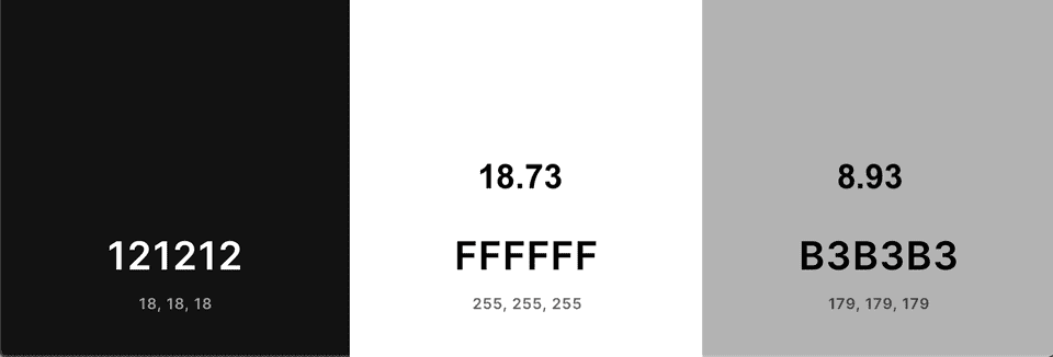
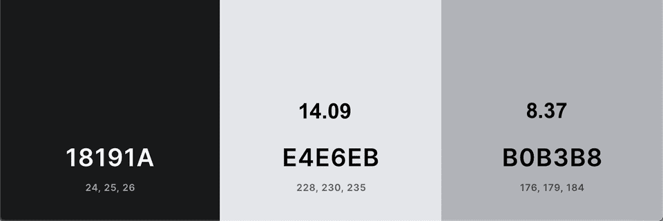
I grabbed the dark mode colors of a couple of popular sites/apps. Every palette image shows the background color, primary text color, and secondary text color from left to right. I put the contrast ratios of the primary and secondary colors with the background color on top of the respective color.
All of these satisfy the AAA standard of a contrast ratio of at least 7 👍🏼
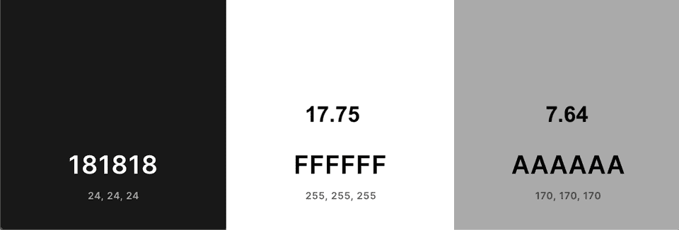
And then we have GitHub’s new look…
Not only do the colors look noticeably darker than their counterparts in other apps, the secondary text color fails AAA standards! It’s important for the secondary text color to have high contrast because of how small the font is. I knew my eyes didn’t deceive me.
While contrast ratios aren’t everything, they are a simple way to quantify the difference between two colors. In this case, it’s clear that GitHub’s dark mode colors are darker. This can make it harder to read text.
Code Review Palette
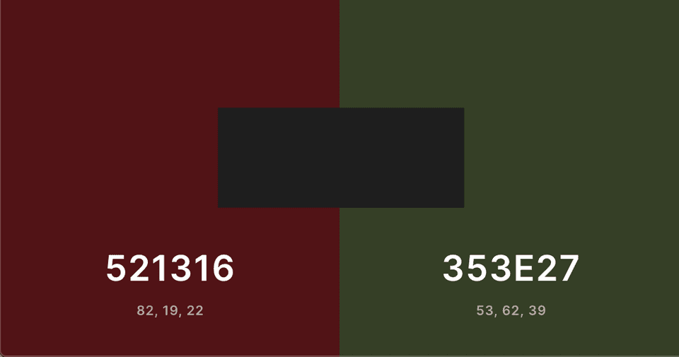
Finally, my main gripe with GitHub dark mode is that the red / green for code diffs looks super off to me.
On the right is the light mode colors and left is the new shades. I overlaid the respective background colors on top:
I did calculate the contrast ratios of both palettes and they were pretty similar (close to 1 lol). However, for some reason the lighter one is easier for me to parse at a cursory glance. Maybe I’m not used to it yet, but I really dislike how dark the new diff colors are. For something as important as code review, I’m using GitHub light mode.
I also investigated VSCode’s Git integration diff colors (which I enjoy!):
IMO these shades work well even on a darker background and don’t hinder code review.
Conclusion
While there is no color theory justification that GitHub’s new code diff palette is worse, its text colors are not as WCAG accessible as other dark mode apps we use daily.
Maybe if GitHub put as much effort into researching their dark mode palette as they did into the promo video they released, we wouldn’t be here. This is still a beta feature so I have hope. GitHub, please give us the dark mode experience we deserve 🥺
Thanks for reading. Happy hacking!
