
Let me preface by saying I LOVE emojis. I use them every day in messaging/texting, on my Instagram, on my personal site, and in my Medium posts. This article represents my personal stylistic opinion.
Notion
Lately, I’ve seen emojis vastly overused, especially on Notion.
Notion is a self-proclaimed, all-in-one workspace. It has a modern, hip, trendy, and minimalistic look. I thoroughly enjoy its use of hand-drawn, black and white caricatures but I just cannot get on board with its (over)use of emojis. While it seems like the entire company’s brand is unfortunately built upon emojis, in this article, I’ll be elaborating on my weirdly-specific vendetta, as well as give a couple of tasteful emoji uses.
The most common use cases I’ve seen on Notion are
- Using emojis in the place of bullet points
- Using emojis to replace periods, and break up text in paragraphs
The Bad: Emojis as Bullet Points
Here’s an example from their homepage:
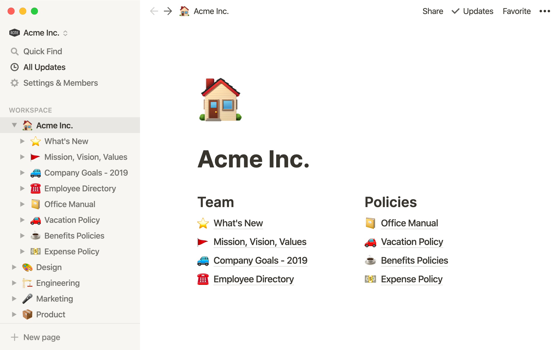 Example recommended template
Notice how without the emojis, we’re left with a super minimalistic file organization system. It uses only a handful of neutral colors with clean black font. While the colorful emoji usage certainly juxtaposes the simplistic template, I argue it detracts from productivity.
First of all, as someone who’s writing this Workspace landing page, you’re committing to using a new emoji with every bullet. In the example above, each emoji is loosely tied to the bullet they’re associated with. A telephone makes sense for an employee directory. Okay, sure.
But what about the red flag next to “Mission, Vision, Values”? This bullet is an abstract concept. It’s clear the person writing this page struggled to find an emoji association here and ultimate settled on a red flag to signify “leadership”. However, a red flag has another meaning, a warning sign for danger which doesn’t make sense here. Even if there was a suitable emoji for “Mission, Vision, Values”, I’m not sure what it would be.
The problem is there doesn’t exist an emoji for every possible phrase. If you’re locked into using emojis as bullets, you might come upon writing a necessary bullet point without a suitable emoji. Then what? Use an unrelated substitute? Would rather get rid of emojis overall.
Finally, as the reader, these colorful icons ultimately are a distraction. For the same reason that most professional sites don’t use every color under the sun, I don’t see a need for so many emojis in a professional workspace.
The Ugly: Emojis as Periods
Notion has also become the place to create fast and easy “landing pages” for personal and professional use. Emojis have trickled down into almost every public-facing page I’ve seen. The inspiration for this article came from this specific one I encountered yesterday:
 Bio of Public Comps
Here, Public Comps uses emojis in the place of periods, breaking up sentences. It seems like they can’t decide on whether or not there should be a period after an emoji… That inconsistency aside, I’m confused about the use of the Woman Shrugging emoji after “… Yahoo Finance”.
“He hated having to double-check…”
This sentence reflects a negative connotation, not the indifference feeling that shrugging conveys. With the overuse of emojis, comes the same problem as above: you’re gonna struggle trying to fit an emoji for every phrase that you think needs one.
Next, I have a-many bones to pick with the founder bios underneath:
 Public Comps founder bios
Hey, what’s up people that use emojis as periods 👋🏼 You know what’s a better ✅ and natural 🌱 delimiter that doesn’t take me twice 👯♀️ as long to read 📚 a paragraph because I’m pausing 🛑 every couple of words to skip over a colorful 🎨 emoji? A SPACE or a PERIOD.
Again, what’s that weird looking paper next to “Salesforce”? Apparently, it’s the receipt emoji. Sales…receipts… ha ha ha 🤦🏻♀️ And I guess Groupon is a corporate company and thus the buildings? Not entirely making the connection here and it detracts, instead of adds, to the accompanying text.
Jon and Howard are not the only ones! This emoji overuse unfortunately reminds me of the vulgar holiday copy pasta texts and middle schooler Instagram bios. You can find all sorts of The Bad and The Ugly by browsing through Notion’s template gallery.
The Good: Tasteful Emoji Usage
I’m ending this critique with a couple of thoughtful emoji scenarios.
GitHub Commits
I’ve seen more and more GitHub repos start using emojis to tag commits:
](https://cdn-images-1.medium.com/max/2006/1*FkEf3laSLBk9OGp9trlqYg.png)
Here, each type of commit is associated with a specific emoji. This cheat sheet lists the suggested ones. Here’s a preview:
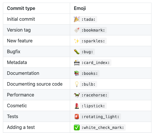
If I know the associated emojis, I can quickly skim the commits and understand what roughly each one is about, without having to read the commit message!
Slack
Love love love emoji reactions on Slack. It allows for a wider range of “replies” to a message while saving space. For example, instead of replying “ok” to a message and notifying everyone in the channel, you can just 👍🏼 or 👌🏼 react. Emojis also make work interactions a little more personal and fun.
Conclusion
I hold the personal opinion that no more than a handful of colorful emojis should be used for professional purposes. Notion and its users have become the worst repeat offenders.
However, emojis can be used tastefully, if they have a purpose other than delimiting! GitHub and Slack are a couple of examples that come to mind.
Next time, save the emoji overload for your texts to your 👵🏻
Thanks for reading!
Originally published in Frontend Digest on Medium.