
If you’re an avid dark mode user like me, you’ll know that dark mode isn’t just about white text on black backgrounds. In a single app, a handful of shades of gray give the app some depth. And across various apps, the spectrum of gray becomes even wider.
I was curious about the dark mode apps and sites I use. Through inspecting elements and getting the hex codes of colors from a screenshot, I analyzed the dark mode palettes of 6 popular apps.
RGB Color Space
RGB
To talk about colors, we should start with how colors can be represented digitally.
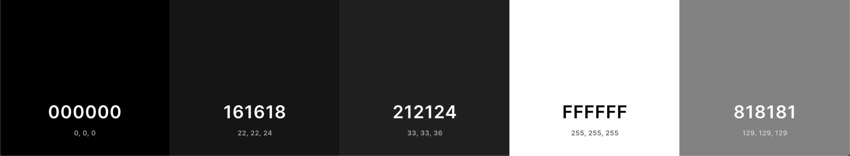
The RGB color space is one of the most popular models. Each color is a combined weight of the three colors red, green, and blue. The weight ranges from 0 (least) to 255 (most) and is usually displayed in a triplet: (red weight, green weight, blue weight). For example, red would be (255, 0, 0) since pure red has no traces of green or blue. A deep eggplant purple is (128, 0, 128) with equal parts red and blue. We also have black which is a lack of color: (0, 0, 0) and white, all the colors: (255, 255, 255).
We can also visualize the RGB color space as a cube with red, green, and blue as the axis. Every color can be “plotted” in this cube.
What we’re interested in are the colors along and around the grayscale line. In this RGB cube, the grayscale line extends from black to white. Every color on this line has the same value for red, green, and blue. For example, medium gray is (127, 127, 127) and is the midpoint of the grayscale line. The closer to 0 the values are, the darker the shade of gray since black is (0, 0, 0).
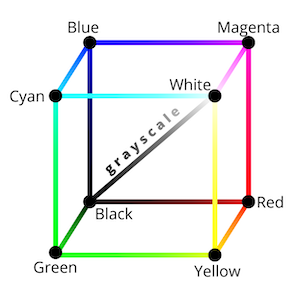 Grayscale line from black to white
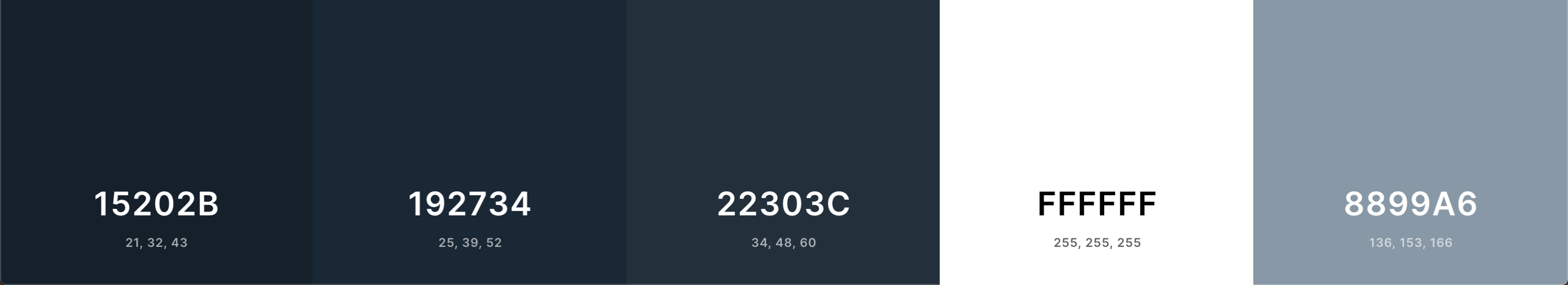
Colors that surround the grayscale line are not pure gray, but rather slightly tinted. For example, Twitter uses (25, 39, 52). Notice how even though the values are close to each other, the blue value is the largest. Thus, this shade of gray is a bit blue.
HEX Codes
To digitize this RGB triplet, we have HTML (Hex) color codes. HTML, CSS, SVGs, and more use hex codes to represent colors. The name comes from how Hex codes are just the concatenation of RGB values in hexadecimal. Sometimes we precede a Hex code with a pound sign. If we convert the aforementioned colors to Hex, we have:
- Red:
(255, 0, 0) → #ff0000 - Eggplant purple:
(128, 0, 128) → #800080 - Black:
(0, 0, 0) → #000000 - Medium gray:
(127, 127, 127) → #7f7f7f - White:
(255, 255, 255) → #ffffff - Twitter blue-gray:
(25, 39, 52) → #192734
Now that we know a bit about RGB and Hex representations, we can explore the world of dark mode.
Anatomy of a Dark Mode App
Across my analysis of various apps and sites, I’ve noticed a some general patterns that most dark mode apps follow:
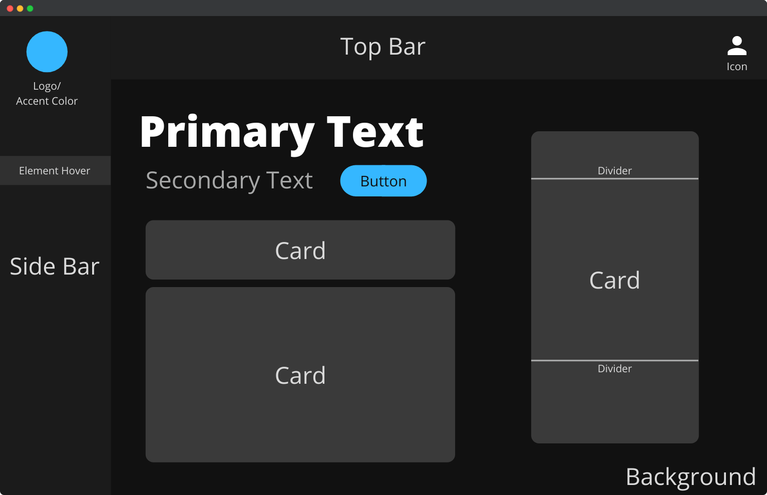
Background
As the most dominant color, the background is almost always the darkest. It’s never pure black — usually a couple of shades lighter.
Menu Bar
These can be found on the side (usually left) or at the top of the app. Menu bars help with app navigation and are lighter than the background color.
Card
With the rise of Material Design, comes the concept of cards. These elements compartmentalize the site content and are lighter gray as well.
Divider
Some cards have dividers to break up the content. Dividers are even lighter still.
Button
Buttons invoke actions and can be gray or the app’s accent color.
Primary Text
The titles and headers. Primary texts are the lightest color on the site, usually very close to white.
Secondary Text
Secondary texts are smaller in font size and a bit darker than their primary counterparts.
Icon
Representing ideas without words, icons are light as well and sometimes are accompanied by secondary text.
These are some characteristics many modern dark mode apps share! Now we’ll examine how these elements apply to popular apps.
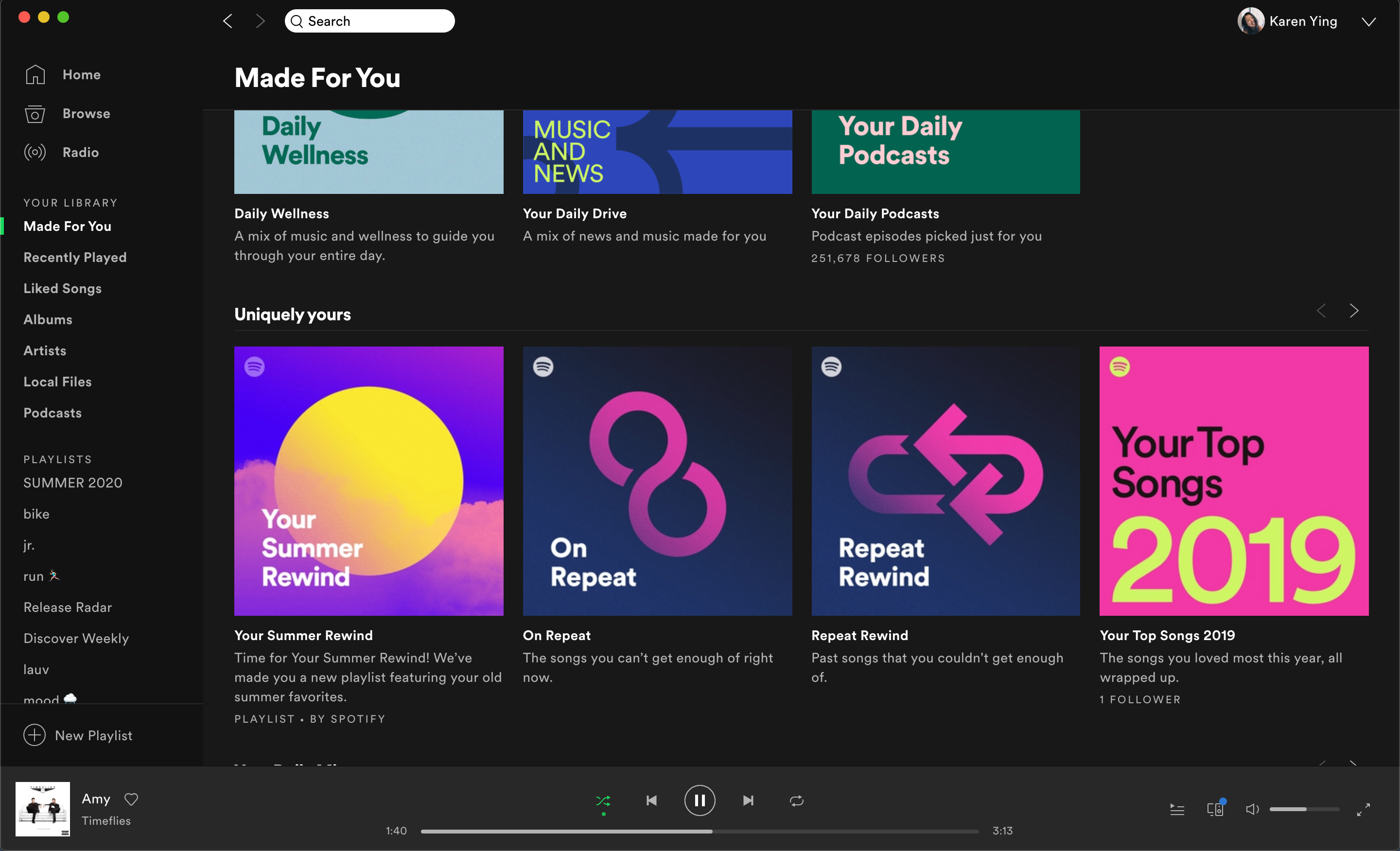
Spotify (macOS App)
 From left to right: background, menu bar, top gradient, bottom gradient, primary text, secondary text
Spotify is the earliest app I remember that only had dark mode. It didn’t start out this way. After undergoing a major redesign in 2014, the streaming service forced the dark theme on all its users. The argument for the switch was as such: the dark background allows for colorful album art to pop, akin to theaters dimming their lights for shows.
Indeed, the colorful album covers contrast with the dark app, and make them appear brighter than they would on a white background:
 Bright colors pop
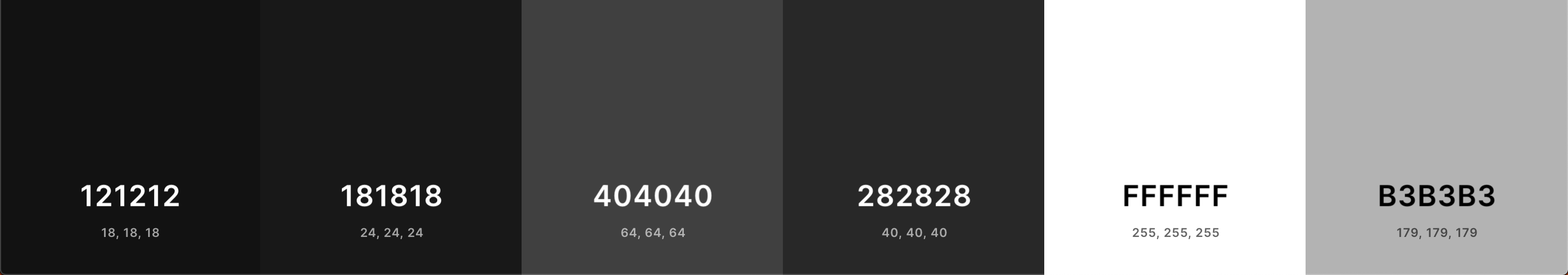
Spotify is also the only app I’ve noticed that uses a gradient for the main background. Referencing the palette, the background ranges from #404040, a much lighter gray, to #181818, almost black. My theory is also that users spend the most time looking at playlist pages:
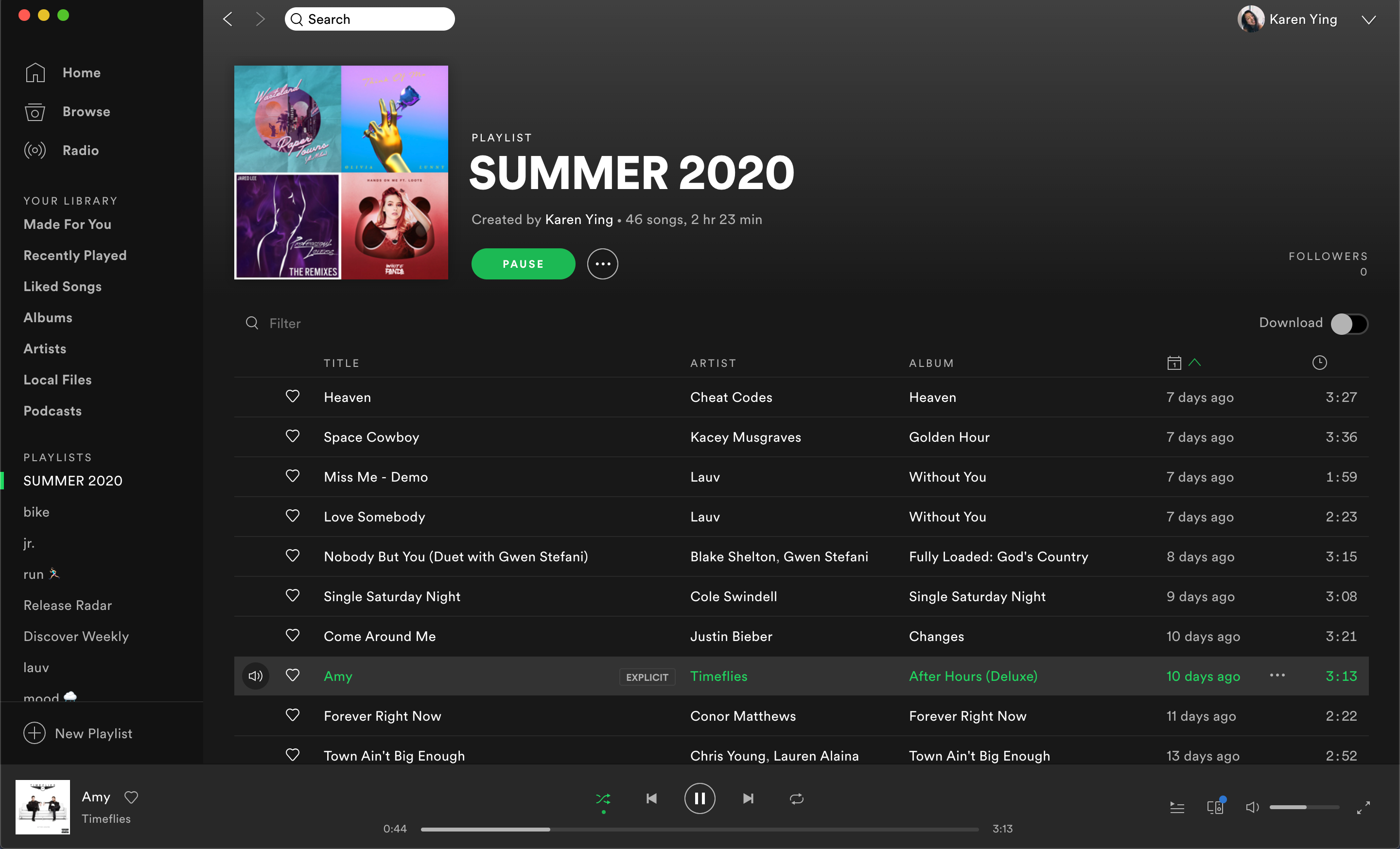
Here, the gradient makes sense for a long list of items, almost imitating motion. On non-playlist pages, the gradient also provides some depth.
Additional comments:
- The primary text is pure white, and the secondary text is a light gray — pretty standard
- Every color is a pure shade of gray, no tints
- The accent color (green) is subtly used to break up the shades of gray
Twitter (Web)
 From left to right: background, card, hover color, primary text, secondary text
Right off the bat, just by looking at the RGB values, Twitter heavily favors blue for its dark mode. For each of the shades, the blue value is the highest.
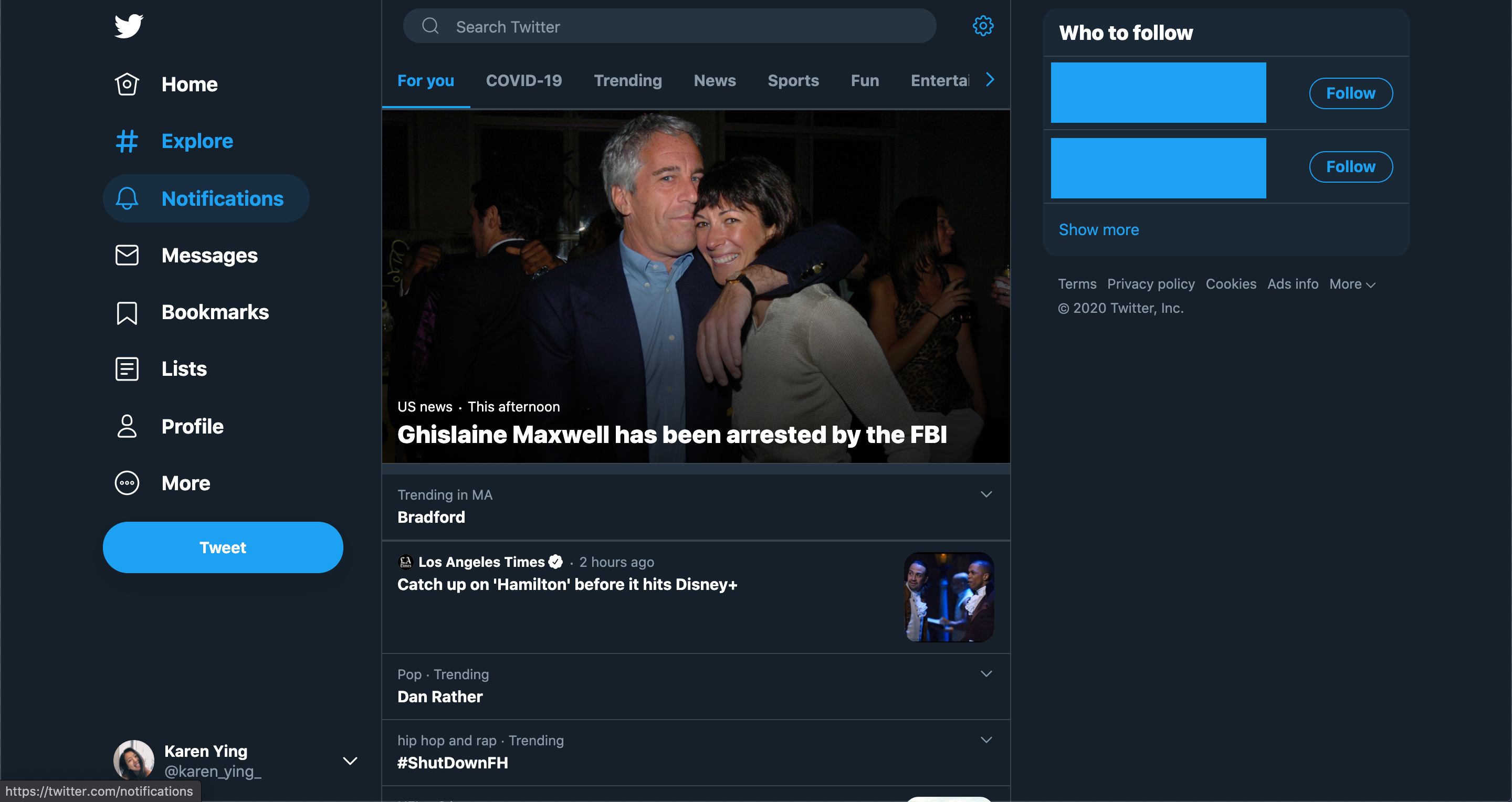
Since its logo/accent color is blue, the blue-ness of the dark mode isn’t surprising and goes well together. As with any app that uses blue as its identifying color, Twitter hopes that this color choice conveys trust and tranquility.
Additional comments:
- Twitter utilizes cards with dividers. The cards are lighter than the background to appear closer, giving a perception of depth.
- The dividers on the cards are a lighter shade of blue
- Primary text is pure white and secondary text is light blue
- Blue accent color used throughout
- Logo is icon-like and is white
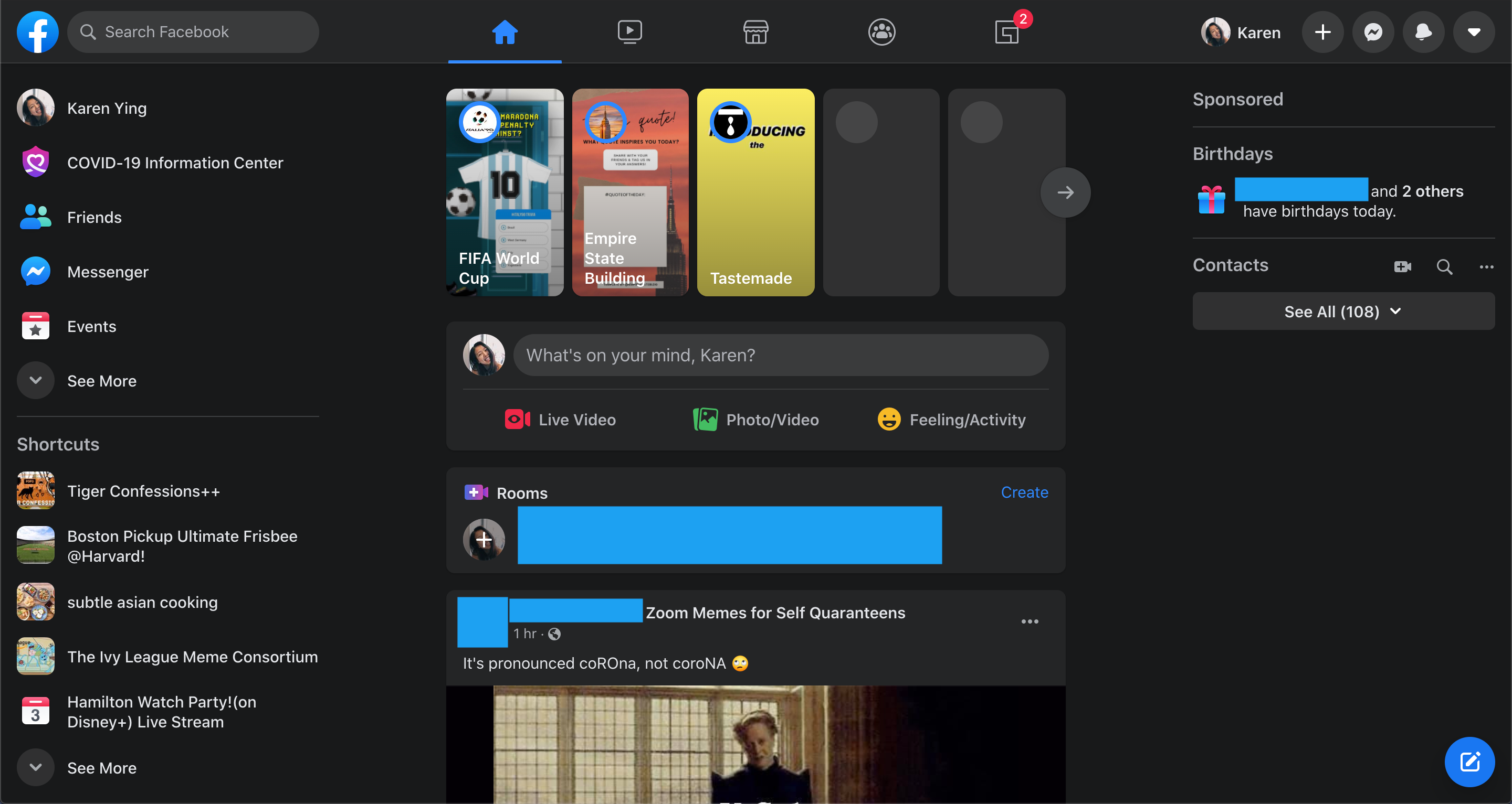
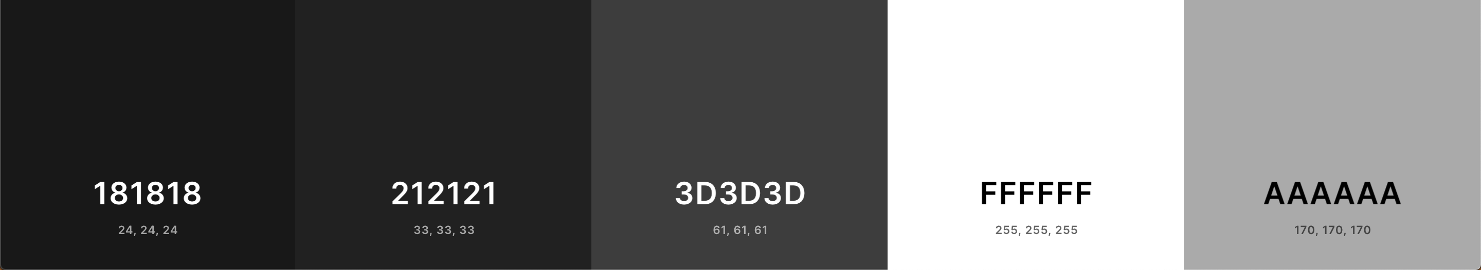
Facebook (Web)
 From left to right: background, card, hover color, primary text, secondary text
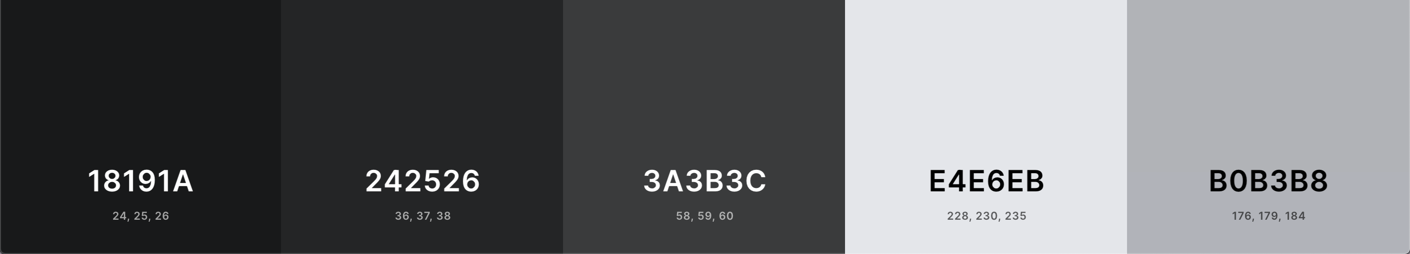
Facebook’s dark mode color decisions are interesting. If you look at the Hex codes, none of the colors are on the grayscale line. Instead, each RGB value is close to each other, slightly increasing from red to green to blue. It’s so subtle that it’s virtually unnoticeable when using the app:
The colors might as well be grayscale colors.
Additional comments:
- Facebook also uses lighter cards
- Lighter dividers are used on left and right menu bars
- The primary text is not white, instead of a shade of very light gray
- The icons on the top right are this off-white as well, encased by gray button circles while the icons on the top are a darker shade of gray. The icons on the left menu are colorful instead
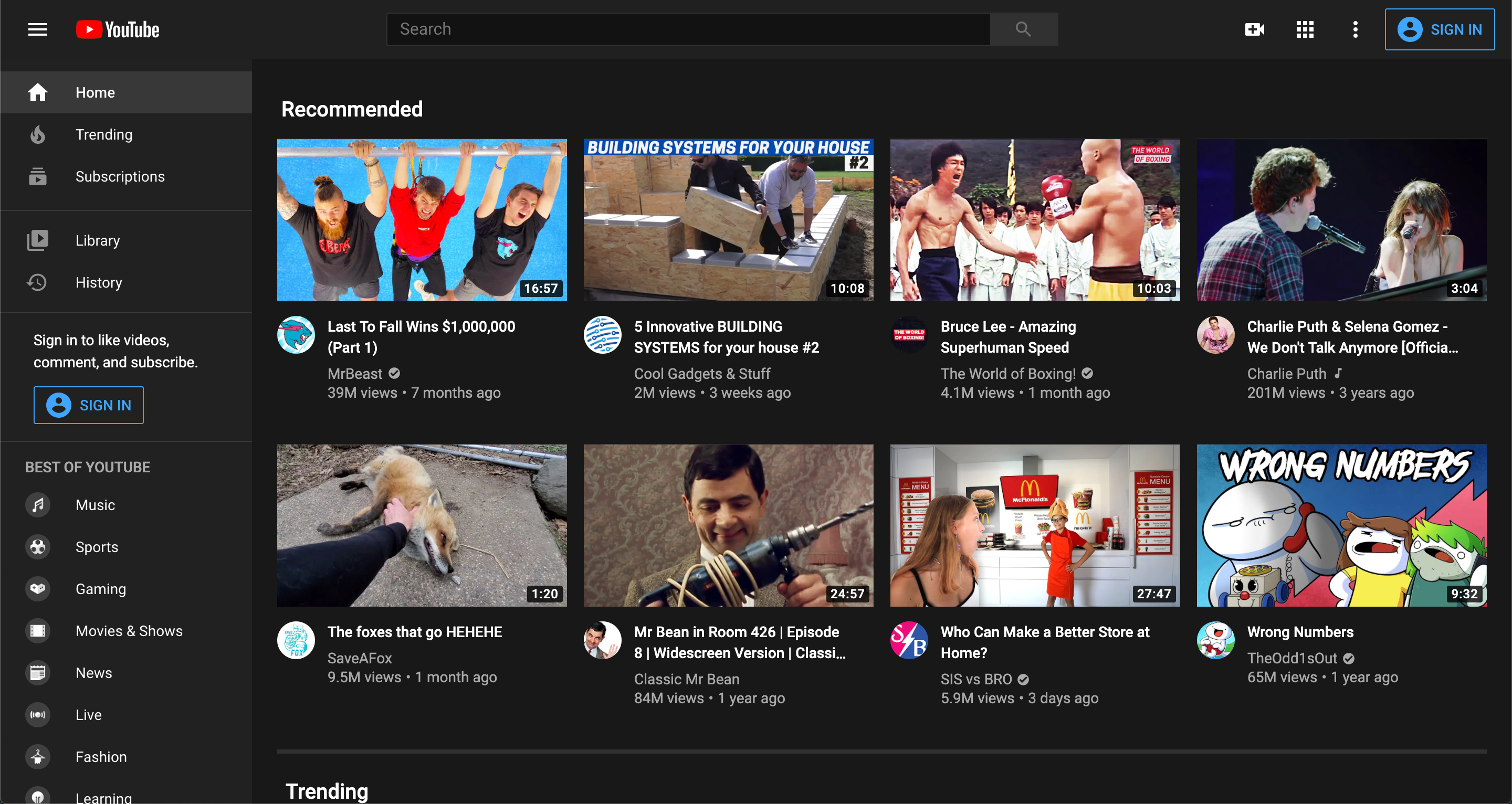
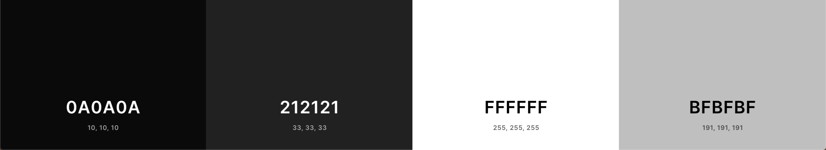
Youtube (Web)
 From left to right: background, menu , hover color, primary text, secondary text
The dark mode palette used by YouTube is almost uninteresting. Each shade of gray is exactly on the grayscale lines. Unlike the apps above, there doesn’t seem to be an accent color. You don’t see the YouTube red anywhere in the app except the logo in the top left.
Medium (iOS App)
 From left to right: background, menu bars, primary text, secondary text
If Medium didn’t have dark mode, I most definitely wouldn’t use the app every night before bed 😅 Much like its plain logo of black and white, Medium’s iOS app’s dark mode colors are super simple. In my opinion, this simplicity works well for a publishing platform — it’s reminiscent of old-fashioned newspapers.
Additional comments:
- The background color is the darkest we’ve seen so far, almost pure black
- Medium uses its green accent color throughout the app as well
Apple
iPhone
 From left to right: background, card (Settings), card (iMessage), primary text, secondary text
Dark mode for the iPhone can be seen in the native Apple apps such as Settings, iMessage, Notes, Photos, etc. Apps that you download can also recognize that you’ve set your iPhone to dark mode and adjust their theme automatically.
Additional comments:
- Unlike all the apps before, the iPhone dark mode uses pure black for the background
- The card colors favor blue. Like Facebook, the blue tint is pretty much unnoticeable
Mac
Now, this is where it gets interesting. Apple actually makes the backgrounds of native Mac apps transparent — but transparent relative to your desktop wallpaper, not whatever is currently open under the app. Thus, there is no decisive palette of colors since wallpapers vary.
However, MacOS does have elements of a typical dark mode app: menu bars, cards, primary/secondary text, etc. Besides the transparent background (which is a really cool touch — I encourage you to explore this for yourself), the MacOS dark mode is predictable.
Conclusion
If you ever thought that all dark mode apps are starting to look the same, you’re not wrong. They share the common elements we learned about: Usually a dark, almost black, background color, with lighter menu bars lining the top and/or sides; even lighter, rounded-corner cards section content, and seem to appear closer because of the color contrast; accent color jellybean buttons, a bright white primary text, and smaller slightly darker secondary text… All the apps blend together.
That being said, there are still ways to slightly deviate from this template. We saw Spotify’s gradient, Twitter’s blue-hued shades, and MacOS’s opaque background. If you’re designing a dark mode app, I encourage you to find ways to subtly stand out. After all, we could use some variety…and more shades of gray.
Thanks for reading!